This is an older article from our newsletter Currents, released in June of 2020. If you are trying to reach our Online Outage Map, click here.
To view the full print/pdf version of this issue of Currents, click here
For previous issues of Currents, visit our Currents Library
Outage Map Updated
By: Steve Sokolowski, Marketing Associate
Email: ssokolowski@sussexrec.com
 During an outage, it is critical for utilities to have open communication with those affected. While some outages are unavoidable, a lengthy power outage poses a huge inconvenience to consumers.
This is why Sussex Rural Electric Cooperative strives to always keep our members informed during an ongoing outage. While we work to fix the problem, we want our members to be able to see its location, the number of others affected, and when a crew has been dispatched.
We’ve been able to share this information using our online outage map, found at outages.sussexrec.com. For those who haven’t made use of it, this is a digital map of our service territory that displays outages on our system in real-time to help members visualize the affected areas and receive an estimate of when we can have power restored. This outage map has been a reliable resource that members can turn to for information during an outage.
Just as we at Sussex Rural Electric are always striving to improve and upgrade our system and service, we want to ensure that the communication tools that we offer to our members are the best they can possibly be. In honor of this, the outage map has recently undergone an update.
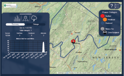
The most obvious changes are aesthetic, but these all aim to improve ease-of-use for our members. The user interface has been simplified to remove clutter and the map has a new, more detailed look. Members can now choose between three map settings – a topographic map, a satellite map, and a night view – to customize their experience. There is also a new weather view setting. When we are experiencing inclement or extreme weather, you can now toggle a RainViewer radar that will display movement of a storm across our map.
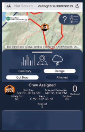
The menu on the left side of the map displays a graph with a 48-hour summary. This lets you track the total number of meters out of power over the previous two days. The way that we display outages has also been changed. The old version of the map would mark areas in various colors and add a hard hat when crew had been dispatched. We’ve simplified this, now marking areas with a hexagon in one of three colors – red for verified outages, orange for predicted outages, and dark blue for restored outages. Inside these shapes, it shows the number of meters currently without power and displays an image of a lineman once a crew has been dispatched.
The outage menu shows each outage’s start time and the time of estimated restoration. We aim to make these estimates as accurate as possible, but please keep in mind that there is always a level of unpredictability when it comes to outages. Another tree may fall, the restoration process may take longer than expected - sometimes things happen that are not planned. We try to update the estimated time of restoral as accurately as possible, but please be aware that it is not an exact prediction.
 We also have a guide built-in to the new map to improve accessibility. If there are any tools on our outage map that you need explained, simply click the question mark icon and then the tool’s icon for more information. This is a small but important new feature that we hope will make our outage map easy to use for everyone.
Accessibility and ease-of-use are at the heart of this update. Our outage map is a tool that we’d like all of our members to be able to take advantage of, regardless of how tech savvy they may or may not be. We hope that these changes will make it so everyone can feel comfortable using our outage map and making good use of the information it provides.


